We continue the series by replicating using as much data and code as provided in the source material. We create a three-state Gaussian Mixture Model and fit it so S&P500 data. I examine the output and give feedback about my coding replication and data sourcing along the way. Then I try to apply a proxy for adding economic data as a feature—previous posts Part 1 and Part 2.
Disclaimer: Not financial advice, only my own opinions. This is not to encourage nor promote taking any trades, positions, or investments of any kind. Any information contained in this website is for informational purposes only and to be taken as is. DWongResearch and the Author (Derek Wong) has done their best to ensure accurate information. Regardless of anything contrary, nothing available on this website should be understood as a recommendation, consult a licensed financial professional in your jurisdiction.
Replication
We are still sourcing the same blog post as a reference guide. My job now is to try to recreate the code as best as possible faithfully. If there are any issues with the code provided as an example, I will make a best guess what I need to do to make it either A) functional or B) assume the author’s intent. There was plenty of code provided by the author. Since we have already covered the maths and theory, it’s time to get our hands dirty.
First we need to get data
The provided code for the data handler was messy, a single function. As mentioned in the previous post, I was unsure what the author used for the inflation / 10-year yield. So since we are using the yfinance package, a quick search led me to ^TNX, an index of the US 10 year yield. So we have covered our first missing link, the ability to get the extra economic data.
Now we are going to need a function that is easy to call. His sequential programming code block is messy when you call something multiple times, and it is not very scalable. So I created a functionalized version of the fetcher.
def getYahooData(symbol, start = '2000-01-01' ):
    """
    Get a pandas dataframe using a yahoo symbol from start date until yesterday as a business day.
    args:
        symbol - str
        start - str in YYYY-MM-DD format

    return:
        pd.DataFrame
    """
    today = datetime.today()
    # dd/mm/YY
    #get last business day
    offset = max(1, (today.weekday() + 6) % 7 - 3)
    timed = timedelta(offset)
    today_business = today - timed
    print("d1 =", today_business)
    today = today_business.strftime("%Y-%m-%d")
    symbols_list = [symbol]
    start = '2000-01-01'
    end = today
    print('{symbol} is Downloading'.format(symbol=symbol))
    r = yf.download(symbols_list, start,end)
    df_pivot = r

    return df_pivot
Then we pull the data.
SPY = getYahooData('SPY')
TNX = getYahooData('^TNX')
In the original example code, the author says they used log returns. However in the actual codebase it was percentage returns.
I amend that by actually implementing log returns. Log returns have a lot of good characteristics so I prefer them anyway, however we will begin to deviate from the original source results.
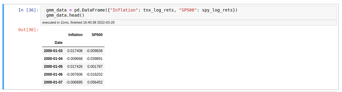
We also drop the first NAN by creating a returns series
Sanity Checks
So I do some quick matplotlib plots just to make sure that things are not strange with either the data or the calculation of returns
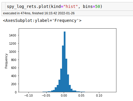
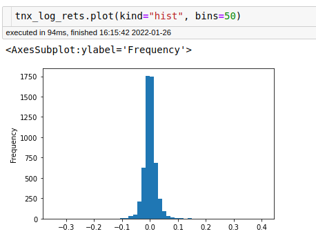
The plots and the table of data look fine. We have data spanning from 2000-01 to 2022-01, so about 22 years of data.
Modeling
Honestly here is were many people can get tripped up, because the packages are just so widely available in Python. I will be using the sklearn library and the modeling and implementation is really easy. Be extremely wary of just throwing data at machine learning algorithims and assuming something workable much less profitable is going to come out.
X = spy_log_rets.values
GMM = GaussianMixture(n_components=3).fit(X.reshape(-1,1)) # Instantiate and fit the model
GMM.converged_
The output here is True. Yes we just fit an unsurpervised learning model on log returns of the S&P 500 in 2 lines, with a convergance check. 3 lines and you have your model.
Understanding what you are doing matters.
Here is why, if you just took that code out or followed the original article, you would be done. Nevertheless, that is not the case. You cannot create the plots using the model output from sklearn. Look at the documentation. We can get out of the fitted mixture’s top three attributes: weights, means, and covariances. How can we create $\mathcal{N}(\mu, \sigma)$ and mix them? Well, basic probability theory comes in handy here. If you did not know it, you could trip up accidentally without realizing it, so beware of not understanding your algorithms.
A refresher, if we take the trace of a matrix (the sum along the diagonals) of a covariance matrix as a vector divided by the number of elements in the vector, then take the square root of that we can back out our $\sigma$ ’s . We will also need to make sure we mix correctly. In my example, I will assume the guassians are independent. They probably are not. So we will need to convert this whole thing into a probability density function and plot that.
Its a lot easier to understand in code.
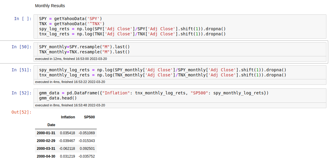
# Convert covairances to standard devation of each mixture
cov = GMM.covariances_
GMM_stdDev = [ np.sqrt( np.trace(cov[i])/3) for i in range(0,3) ]
Now again we need some probaility theory here to create the PDFs (probabilty density functions) of each of the individual guassians, in our case 3. I use the scipy.stats multivariate normal in order to help facilitate that calculation.
pdfs = [p * ss.norm.pdf(x, mu, std) for mu, std, p in zip(GMM.means_.ravel(), GMM_stdDev, GMM_weights)]
This creates each of our guassian normal probabilty density functions given the means from the model, our backed out standard devations, and the weights of the model.
Figure 1: PDFs of the 3 underlying guassians
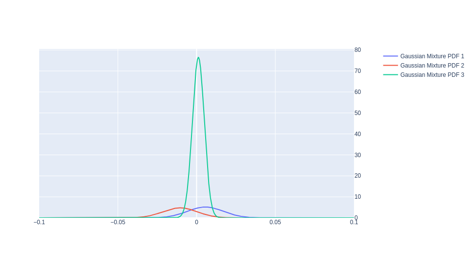
Here is the plot of those 3 guassians PDFs. In blue we can have a more ‘bullish’ case, in red a more ‘bearish’ case, and in green the ‘neutral’ state of the market. This plot has some really cool attributes in that it does contain a lot of the stylized facts that come to mind when we think about the S&P 500. It has fat tails and specifically the left tail(red) is larger than the right tail(blue). While the largest distribution has its mean slightly above 0, implying positive drift.
Now we mix them together.
Figure 2: PDFs of the 3 underlying guassians and the total mixture
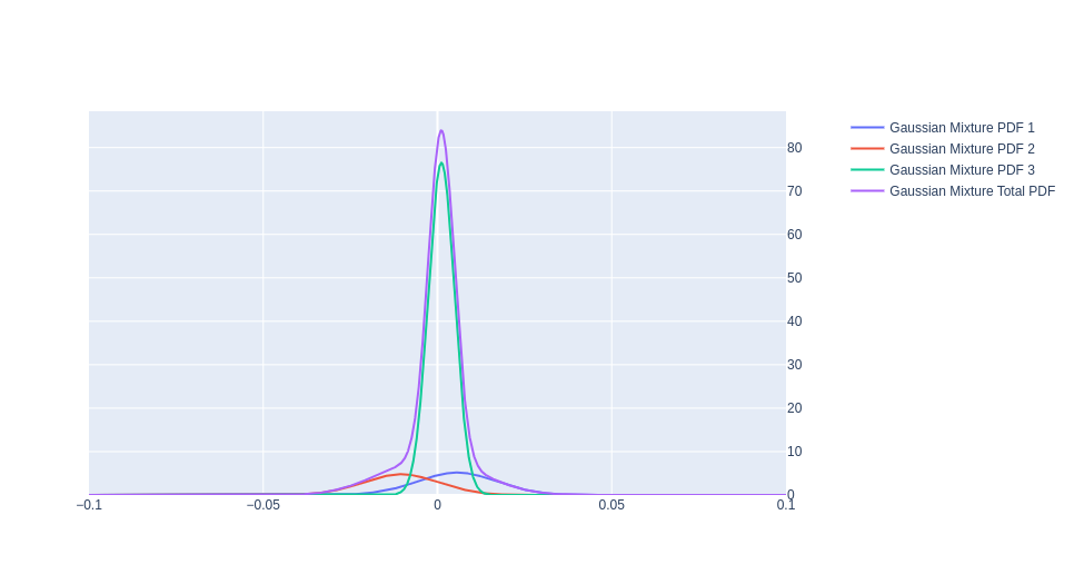
The purple line really highlights those stylized facts. Here it is as a stand alone.
Figure 3: PDF of th Total Mixture
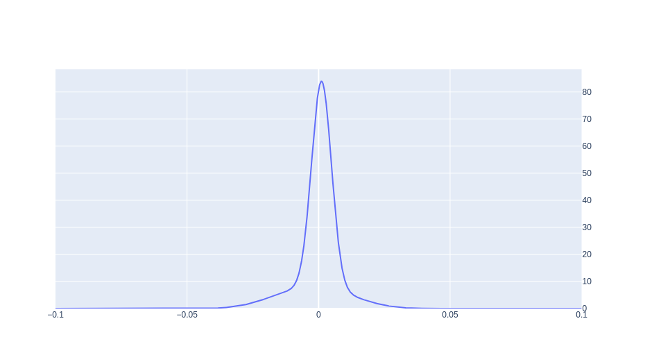
It is certainly not normal, it has a slightly above 0 peak value, and the left tail is larger in magnitude than the right. Lets see how it stacks up against our training data, or rather the S&P 500 it was trying to model.
Figure 4: S&P Log returns vs GMM Total Mixture
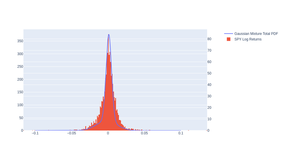
Not well. Although it captures the information in the distribution a heck of a lot better than a standard normal distribution, it is no were near fit even looking from the naked eye. GIven that this is also the test set is a bit, well off putting. Let’s see if we can improve this by adding another feature.
Adding an economic feature
Here again, I am going to divert from the original document. I will use the returns of the 10-year yield instead of the index number itself. The yield components are not strictly just inflation risk but also expected real rate and the real term premium. For example, we know that the Federal Reserve controls the Federal Funds Rate, which gets moved up and down, trickling down into the longer end of the yield curve. So the floor level of the yield curve is set by an institution, not the market, which can cause things to have parallel shifts up and down. Maybe I am getting too cute, but I have always felt the rate of change to be more impactful in macro variables. This rate of change will also keep us in the same dimension as our S&P 500 log returns, as I took the log-returns of the Treasury Yield Index. Usually, in machine learning, having bounded and scaled features helps. This transformation also achieves that aim.
I have created a new data frame using the Inflation proxy with the TNX log returns, and the S&P500 log returns.
I had to switch my space and my plotting method because of the limits of my home machine. I only have 32 GB of ram and plotly is greedy when it comes to plots that have a lot of elements so I have had to default to matplotlib which is much less beautiful but resource saving. I am also shifting space into negative log likelihood as predicted by the GMM. This is a similar shift that we see in the original content.
As I am writing this I realize something very suspicious in the original post. The first part, which is done in the daily timeframe moves to monthly in the second part. No wonder, if you do it on daily you end up with this blob. This blob has no information whatsoever.
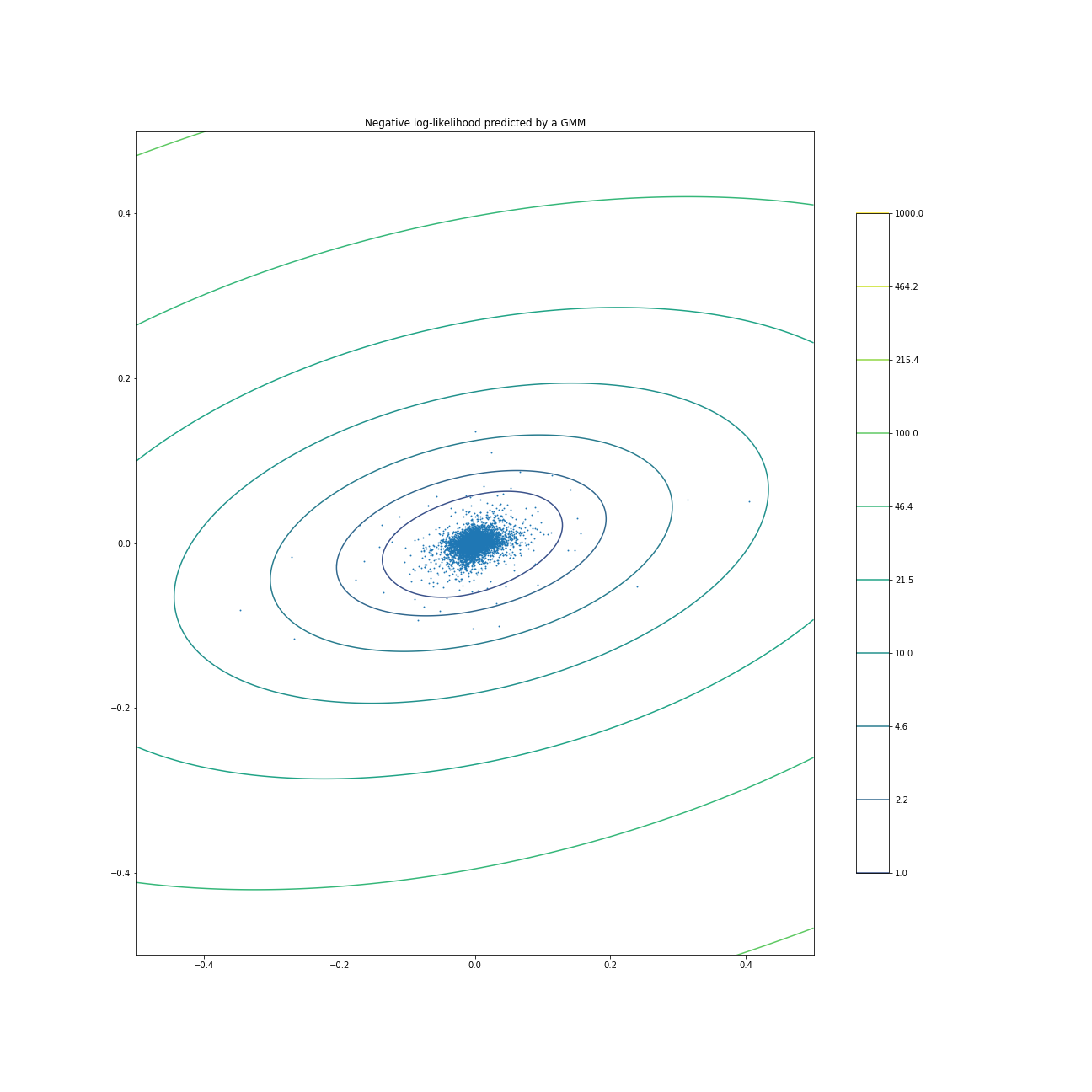
Missed the fine print
Honestly after I saw my result and saw theirs, I was for sure just going to end this post with a result of unable to replicate. Sometimes when you are doing the work you realize there may be some differences only when you really read it carefully, in my case many times. If you are not careful you will miss it, the text itself does not hint at a change in the result. However if you look at the final plot they shared, the axis holds the key. It is now Monthly Inflation and Monthly Returns, which is for sure some kind of change to make the academic blog post look good rather than have any finite information. We cannot just swap our time frame of study just to have a more beautiful plot if you are practitioner, if you are an academic then why not.
Lets see if I also change time frame if it works
So here we go again, doing a copy pasta of my own code and just changing the returns from daily to monthly log returns.
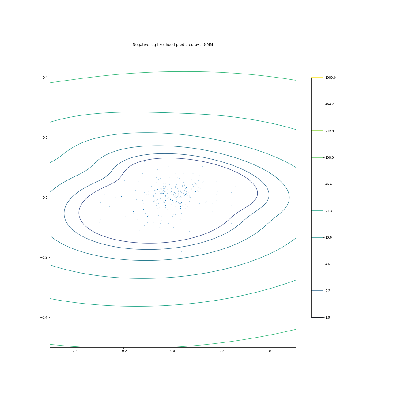
To be fair this one is much better, but since I do not have the original authors plotting code I have no idea if we have something similar or not. From the shape of the Log Normal contours we do have more information here but I am not sure its actually predictable. We do see a small bubble going from lower left to upper right but it does not look that strong. X axis is inflation, Y axis is S&P 500 data. So potentially there is a positively correlated relationship between inflation and S&P 500 returns over the sample period, but it seems weak.
Conclusion
Well there you have it. It took me a lot longer than I expected to finish this, not only because I kept blowing up my notebooks but because of how many slight details were actually different from either my ability to replicate based on the resources I have on hand or gaps in what the author is communicating. Overall I think I learned a lot from Gaussian Mixture models, it maybe something I continue to evaluate because of the tail capture component but as a naive clustering it didnt seem to work.
You can find the notebooks here on my github https://github.com/dwongresearch/blogCode/tree/main/InternetAlphaPart4
The Caveat
This is my first experience with using Gaussian mixture models, there is a large chance that I used them incorrectly. So if anyone sees a mistake I made or an edit please reach out so I can amend it and learn something. The entire point of this post was to learn a new tool, I did my best to ensure accurate information as I learned it.
Also if you actually have any idea how to create those types of plots I would like to know how. Thanks.